Bulletproof flag components
A resilient take on a flag-like media object.
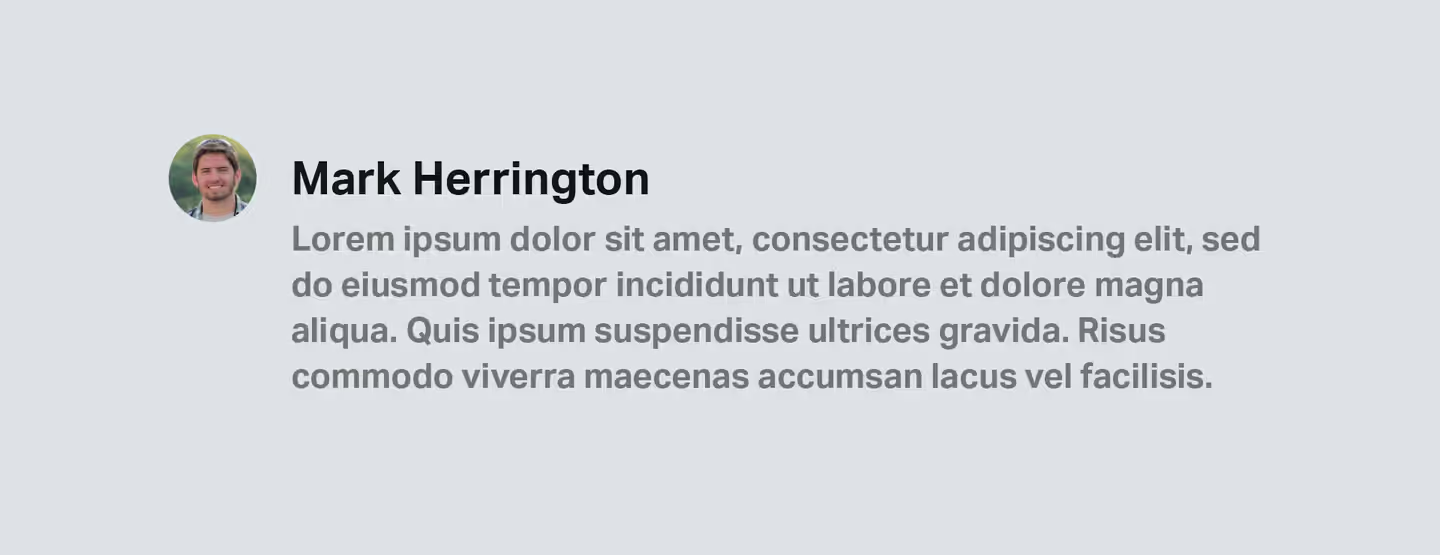
I’m a software engineer living and working in East London. I’m currently helping to build a one-stop-shop for the digitisation of alternative assets over at Daphne. Although once strictly front-end, today I work across the whole stack, including dipping my toes into DevOps and writing Rust & Go.

When I joined Browser I was tasked with working on Twine, an in-house SaaS extranet. Most of the frontend was already built, including the beginnings of a highly reusable component library. One component in particular stood out for me: the ‘flag’. A flag is similar to the ubiquitous media object, but with a more nuanced alignment:
Instead of the graphic being aligned to the top of the component, it’s aligned to the centre of the title, a pleasant visual tweak — especially when pairing an icon or avatar with a block of copy. I’ve seen this pattern crop up continuously in designs. Once you start looking for it, you realise it’s everywhere.
Back when I was getting started, the simplest answer was nudging the title or graphic with margin, however, thanks to modern CSS a more versatile solution is possible.
If you want to jump ahead, here’s a pen. The pen and the snippets below use SCSS, but only to allow for nesting.
The problem
In order to proceed I’m going to break down the flag into three parts: signifier, title and content.

To summarize what we’re going for:
- Flags should layout a signifier next to a block of copy (which is usually wider).
- The signifier should be centered to the title, if present.
- If the signifier is larger than the title, then the title should be aligned to the centre of the text, but (crucially) allow the content to flow underneath it. We’ll come back to this later.
- The title or content should be optional, retaining similar alignment/spacing properties when absent.
First pass
Adam Wathan has a neat solution for a similar pattern, which involves ensuring the computed line-height for the signifier is the same as the title. This works great if the title is larger than the signifier, but not if the signifier is larger than the title. Even if we set a value based on the signifier’s height, we’ll get an awkward line-height on any wrapping title text.
At a glance it seems like we could simply use flexbox to handle the alignment. If the icon is smaller than the title, we can simply wrap both and align them vertically with flexbox. However, if the icon is bigger, we get an awkward gap between the title and the copy:
This is nothing that a little negative margin couldn’t solve, but we’d need to calculate the amount to pull the copy up by — in which case a traditional media-object with a margin adjustment would serve just as well.
Grid
Fortunately, CSS Grid provides the required flexibility. We can divide our flag into 2 columns (signifier and content) and (perhaps un-intuitively) four rows:
 HTML<div class="flag">
<div class="flag__signifier">
<img src="/icon.svg" alt="">
</div>
<div class="flag__title">
<h2>Example</h2>
</div>
<div class="flag__content">
<p>Aliquam consectetur est diam, quis auctor dui ullamcorper eu. Sed porttitor velit sed varius placerat.</p>
</div>
</div>
HTML<div class="flag">
  <div class="flag__signifier">
    <img src="/icon.svg" alt="">
  </div>
  <div class="flag__title">
    <h2>Example</h2>
  </div>
  <div class="flag__content">
    <p>Aliquam consectetur est diam, quis auctor dui ullamcorper eu. Sed porttitor velit sed varius placerat.</p>
  </div>
</div>
 Sass.flag {
display: grid;
grid-column-gap: var(--flag-gap, 1em);
grid-template-columns: auto 1fr;
grid-template-areas:
'signifier .'
'signifier title'
'signifier content'
'. content';
}
Sass.flag {
  display: grid;
  grid-column-gap: var(--flag-gap, 1em);
  grid-template-columns: auto 1fr;
  grid-template-areas:
    'signifier .'
    'signifier title'
    'signifier content'
    '. content';
}
This ensures the title is always in the middle of the signifier, but also that the signifier can ‘bleed’ from both sides of the title and sit alongside the content.
We can then set the height of our rows:
Sass.flag {
  // etc.
  grid-template-rows: repeat(3, minmax(min-content, max-content)) 1fr;
}
The first three rows are given equal height, which we set as minmax(min-content, max-content), allowing them to fit their content but also shrink down to nothing.
The final row fills the remaining space, since it contains the overflow for the content. We just need to set the grid-area for it:
Sass.flag__content {
  grid-area: content;
}
We’re also going to centre the signifier using flexbox, meaning it doesn’t have to occupy all three rows to remain correctly aligned:
Sass.flag__signifier {
  grid-area: signifier;
  display: flex;
  align-self: center;
}
That’s all there is to it.
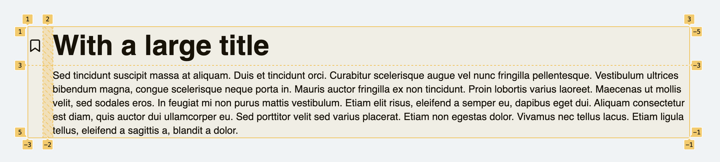
Here’s an example where the signifier is smaller than the title:
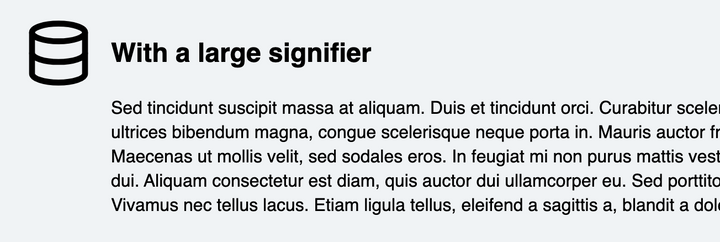
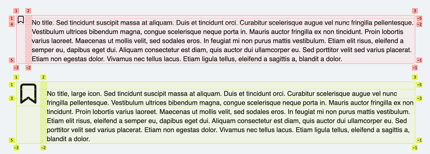
Here’s an example with a signifier that eclipses the title:
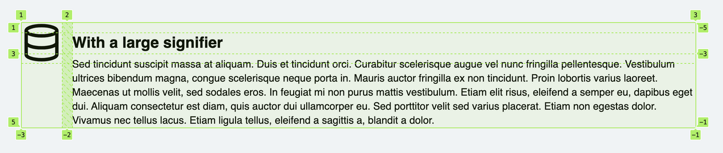
Note that the copy runs cleanly underneath.
Sans-title
Things get a little more complex if we want to support flags without titles.
The signifier and the title are closely coupled, with the computed line-height and signifier height providing the alignment boundaries. If we simply promote the content and remove the title we get part of-the-way there:
Sassgrid-template-areas:
  'signifier .'
  'signifier content'
  'signifier content'
  '. content';
However, we don’t elegantly handle icons that are smaller than the accompanying line-height, which instead appear aligned to the top of the block:
To fix this we need to ensure that the middle signifier row is at least as tall as the copy’s line-height:
Sassgrid-template-rows: minmax(min-content, max-content) calc(1em * 1.4) minmax(min-content, max-content) 1fr;
Unfortunately this kind of calculation is what we were trying to avoid in the first place. A less explicit alternative is to reinstate the (empty) title and use a pseudo-element with the same typographic styles as the body copy, positioned in the middle row of the signifier:
Sass.flag__title {
  // ...etc
  // Overlap the title with the middle signifier row:
  grid-column: 1;
  grid-row: 2;

  // Create invisible copy for alignment:
  &:after {
    content: "x"; // Can be anything
    visibility: hidden;
  }
}
Provided that the font-size inherited by the flag is the same as the content, this results in a ‘cleaner’ solution.
In the above snippets I modified grid-template-rows, grid-template-areas and .flag__title, suggesting the addition of a modifier class (such as .flag--no-title). However, we can actually cheat a little and force things into place using the :empty pseudo selector:
Sass.flag__title {
  &:empty {
    grid-column: 1;
    grid-row: 2;

    &:after {
      content: "x";
      visibility: hidden;
    }

    ~ .flag__content {
      grid-row-start: 2;
    }
  }
}
This requires that the title element is still rendered when empty (and without enclosed whitespace). Either works, so choose which appears cleanest.
Run it up the pole
Here’s the final solution (with examples):
See the Pen Bulletproof Flag Component by Jay Freestone (@jayfreestone) on CodePen.
It’s such as simple component, but something I’ve found extremely useful over the last year. Let me know if I’ve missed anything, or if you discover an even better technique.