Contained aspect-ratio boxes
A modern attempt at creating a CSS-only aspect-ratio box that fills its wrapper.
I’m a software engineer living and working in East London. I’m currently working on procurement orchestration over at Omnea. Although once strictly front-end, today I work across the whole stack, including dipping my toes into DevOps and writing Rust & Go.
Sometimes you encounter a problem repeatedly throughout your career. Usually after the first few times you codify your approach, forging a ‘silver bullet’ for next time. However, on occasion, the problem is so obtuse you never quite nail it down. For me, that problem is the CSS-only contained aspect-ratio box.
Here’s what I’m talking about:

In the above example, a white wrapper contains a red box. The height of the wrapper may be fixed, or perhaps dictated by other elements/layout. The box has a fixed aspect ratio, and must occupy as much of the wrapper as possible whilst maintaining that ratio.
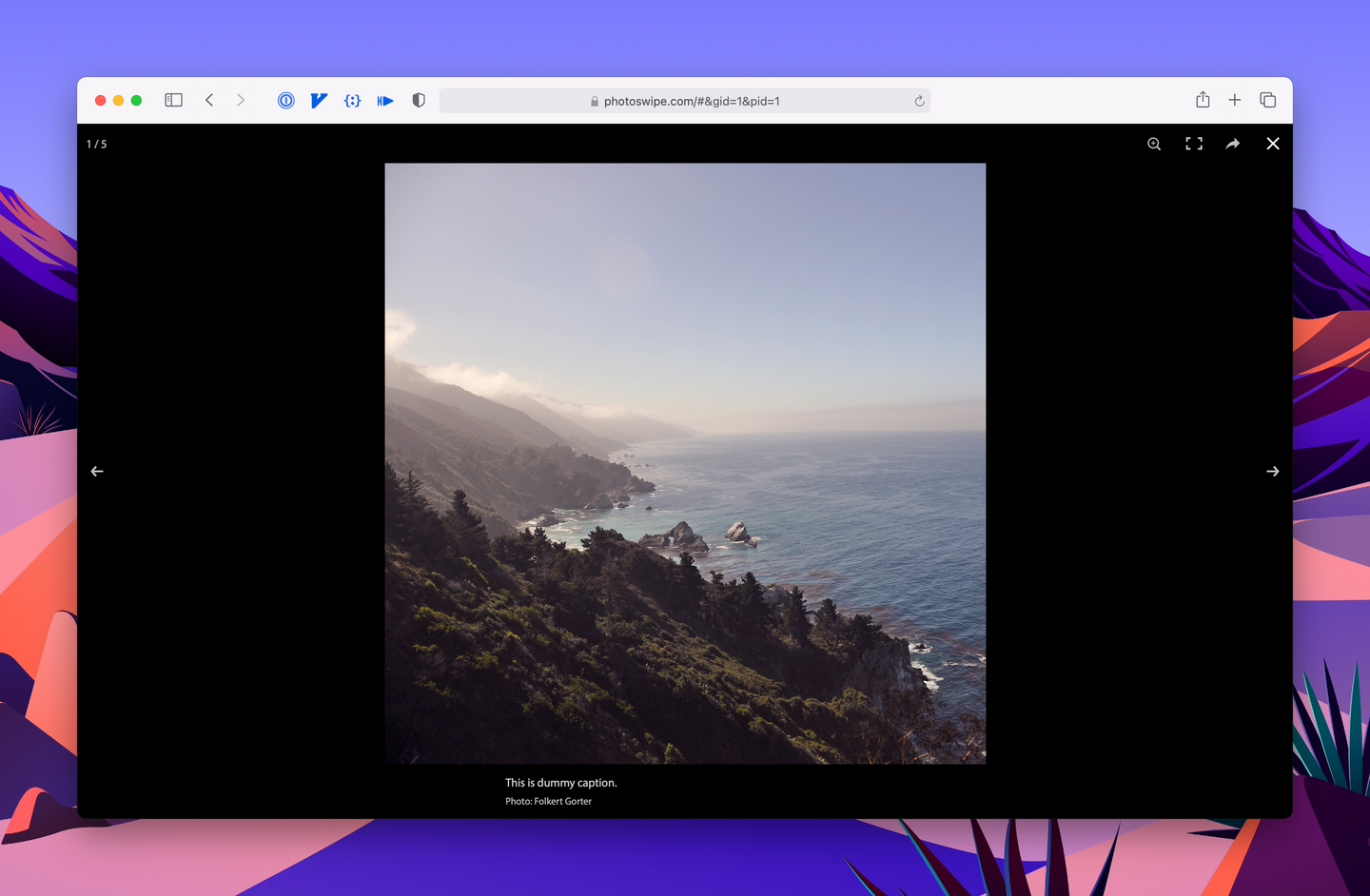
If this sounds contrived, consider a lightbox. Upon clicking a thumbnail, a full-screen overlay appears, displaying an image in its original aspect ratio which fills the available space. The image (provided it is big enough) always fills the screen either vertically or horizontally.
Traditionally this is implemented with some light JavaScript, however I think finally the above layout is now doable with CSS alone. Before I get into my attempt at it, there are at least two other methods of accomplishing this that I’m aware of: object-fit and/or a media query.
object-fit
If the target is a replaced element (an image or an iframe, for instance), you can use object-fit: contain and simply stretch it to fill the parent:
 CSS/** The box is an <img> in this example */
.box {
width: 100%;
height: 100%;
object-fit: contain;
}
CSS/** The box is an <img> in this example */
.box {
    width: 100%;
    height: 100%;
    object-fit: contain;
}
This works perfectly — but only with replaced elements. No dice with a <div>, and therefore no dice with placeholders. Perhaps you could generate and serve up lightweight SVG's with the same aspect ratio, but I don’t think you’ll have much luck with inline ones — which certainly removes much of the appeal.
max-aspect-ratio
If your box’s size can easily be derived from the viewport, you can use viewports units and a max-aspect-ratio media query, as demonstrated by Ana Tudor.
This is a slick solution. However, the media query is viewport-specific, limiting this one to lightboxes and slide-decks.
A more versatile solution
Using modern CSS functions, such as min() and max(), it’s now possible to do this in CSS with one (significant) caveat: you have to know the height of the parent.
Here’s a pen of my attempt, and the code in question:
CSS/** The 'box', probably a <div> */
.frame {
  --frame-ratio-w: 16;
  --frame-ratio-h: 9;
  /** The one predetermined value. */
  --frame-max-height: 30rem;
  /** Padding is width/height, since % padding is based off the element's width */
  --ratio: calc(
      var(--frame-ratio-h) / var(--frame-ratio-w) * 100%
  );
  /**
   * The height of the frame is either the calculated padding value, or a maximum
   * passed in (using --frame-max-height). This effectively clamps the height.
   */
  --frame-height: min(
    var(--ratio),
    var(--frame-max-height)
  );
  position: relative;
  padding-bottom: var(--frame-height);
  /**
   * The width should be 100% where possible, but should maintain aspect ratio
   * first and foremost. In order to do so we can take the calculated height
   * and reverse engineer the width.
   */
  width: min(
      calc(
          var(--frame-height) * (var(--frame-ratio-w) /
          var(--frame-ratio-h))
      ),
      100%
  );
  height: 0;
}
In the above example, we use the traditional padding-bottom hack to give the box the correct aspect ratio:
CSS--ratio: calc(
  var(--frame-ratio-h) / var(--frame-ratio-w) * 100%
);
However we also cap it to ensure it does not exceed the container’s height:
CSS--frame-height: min(
  var(--ratio),
  var(--frame-max-height)
);
This ensures that, when there is room within the container, the box will have the correct aspect ratio; and when there is not enough room, the box will not overflow.
The missing piece of the puzzle is ensuring that the width of the box adjusts itself as well. Since we have already calculated the height, it is quite trivial to do the reverse and determine the width. The width of the box becomes: height * (ratio w / ratio h).
CSSwidth: min(
  calc(
    var(--frame-height) *
    (var(--frame-ratio-w) / var(--frame-ratio-h))
  ),
  100%
);
Once again we wrap the calculation in a min to ensure that the width does not exceed the wrapper.
As far as I can tell this produces the desired result with no drawbacks, works independently of the viewport, and is compatible with any generic HTML element.
Having to specify the height is unfortunate, but not a game-breaker. Applications for this technique will often involve a ‘film-strip’ style layout with a predefined content height anyway:

It is a bit limiting when you would like to derive the height as a fraction of a parent, but I couldn’t think of a way around it. Shoot me an email if you can think of a more elegant solution.
Hopefully once aspect-ratio lands this will be solved once and for all. Until then, this is the closest I’ve got to a silver bullet.
Here’s one more link to the working example.
Edit (14/08/21):
aspect-ratio is here, and it’s beautiful.