Cutouts with CSS Masks
Creating a button with a notch cut out using composited CSS masks.

I was recently tasked with creating a distinctive button component for an online-ordering platform. Something a little like this:
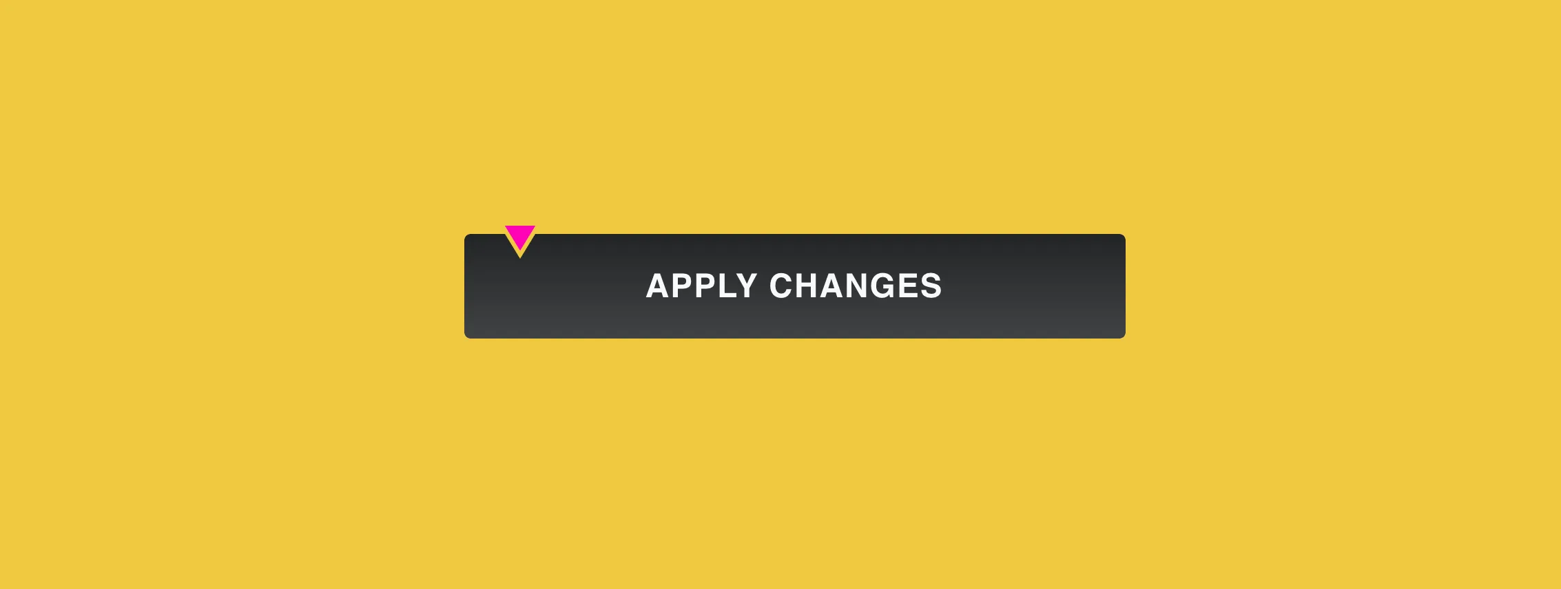
Here’s the gist:
- The triangle is a fixed size, always occurring with the same offsets.
- The triangle cuts out a chunk of the button, giving the appearance of a gap.
- The triangle should animate on
hover.
My first thoughts went something like:
- The triangle can be an SVG.
- The cutout can be a border which matches the background behind the button.
- Using an inline SVG and CSS custom-properties we can easily swap out the border colour, thereby supporting varying backgrounds.
It’s straight-forward, but far from resilient. What if the button is placed onto a gradient (or photograph)? Moreover, isn’t it a bit hacky having to set the property for each different background?
I figured it must be possible to genuinely cut out arbitrary shapes from elements using CSS, particularly now we have clip-path. Turns out it is, but clip-path isn’t necessarily the best tool for the job.
The problem with clip-path
clip-path defines a visible region, meaning that if you want all but a tiny chunk of the button to be visible, you need to define a path or polygon which is the inverse of the original. Here’s a demo of what I mean, using Clippy:
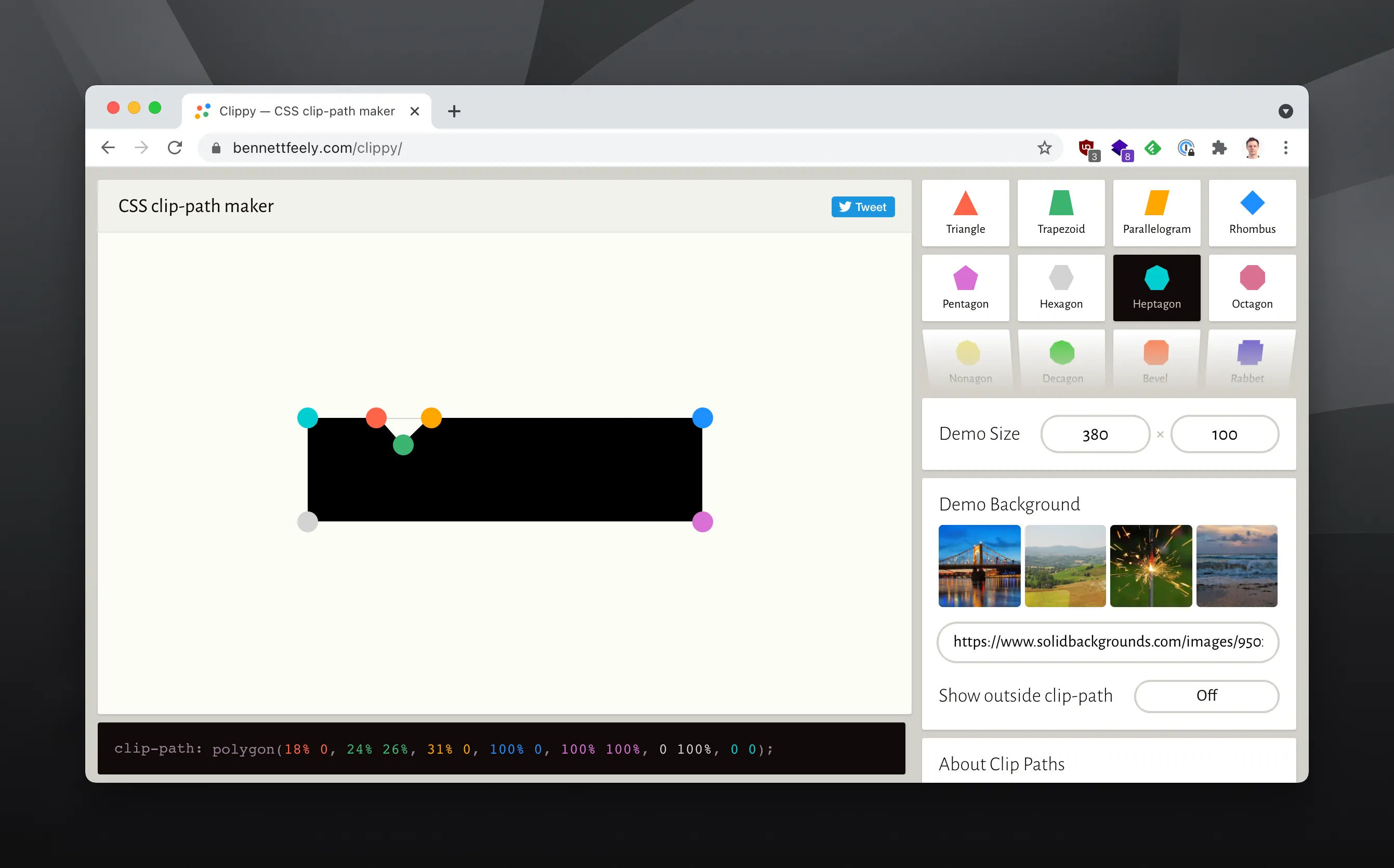
Beside the inconvenience (which could be minimised by supplying the URL for an SVG), there is a mismatch of intent. Our aim is to clip a fixed-size portion of a variable size element — after all, the button could extend to any length. If we define a path that scales, so will our triangle. Yet if we fix the size of the button, we’ve lost a huge amount of flexibility.
It may be possible to use a sliding doors style technique, with a fixed-width clipped panel alongside a stretchy one that houses the contents. Unfortunately this would complicate the implementation of more detailed button backgrounds (think gradients or textures) and is unlikely to fully solve the scaling issue unless the height of the button was also restricted.
Edit: See the end of the article for an update on using clip-path.
Fortunately, masks provide a more concise solution.
Layering masks with mask-composite
Much like in your graphics editor of choice, masks hide every part of the source which isn’t black, meaning that (as before) we would effectively need an inverted image to achieve the cut-out.
However, unlike clip-path, the mask property can take multiple values. We can make use of the lesser-known (and less standardised) mask-composite property to dictate how masks interact with each other when applied to the same element.
The exclude value is just what we need:
exclude: The non-overlapping regions of source and destination are combined.
When applied, each subsequent mask subtracts from the previous one. To achieve our effect, we first apply a full-width mask of solid black, effectively rendering the entire contents of the button. We then apply the fixed-dimension triangular mask on-top of the solid mask, which results in the triangle being ‘cut out’:
mask-image:
  linear-gradient(black, black), url("data:image/svg+xml;utf8,<svg>etc</svg>");
mask-composite: exclude;CSS
The result is a mask which is solidly opaque everywhere apart from the triangle. It’s then just a case of adjusting the positioning:
mask-size:
  100% 100%,
  22px 18px;
mask-position:
  top left,
  1rem 6px;
mask-repeat: no-repeat;CSS
Putting it together
Here’s a pen:
See the Pen CSS Cutout Button with Mask Composite by Jay Freestone (@jayfreestone) on CodePen.
A few notes:
- In the example I’ve used prefixed properties, however you’d want to include both prefixed and un-prefixed properties in production usage.
- Unfortunately
excludedoesn’t work in Blink/WebKit based browsers. Instead there is a separate (non-standard) set of values.xoris the closest to what we want, so including it alongsideexcludewill cover your bases. - In the example we can’t clip the entire button, since we’re placing the offset triangle inside of it. Instead, we need to apply the button background (and the clipping) to a separate (pseudo) element.
- For the mask I have used pixels for clarity. For production usage
em’s would be more appropriate.
Finally, it’s also worth noting that the example presumes two separate SVG’s that share the same canvas dimensions:
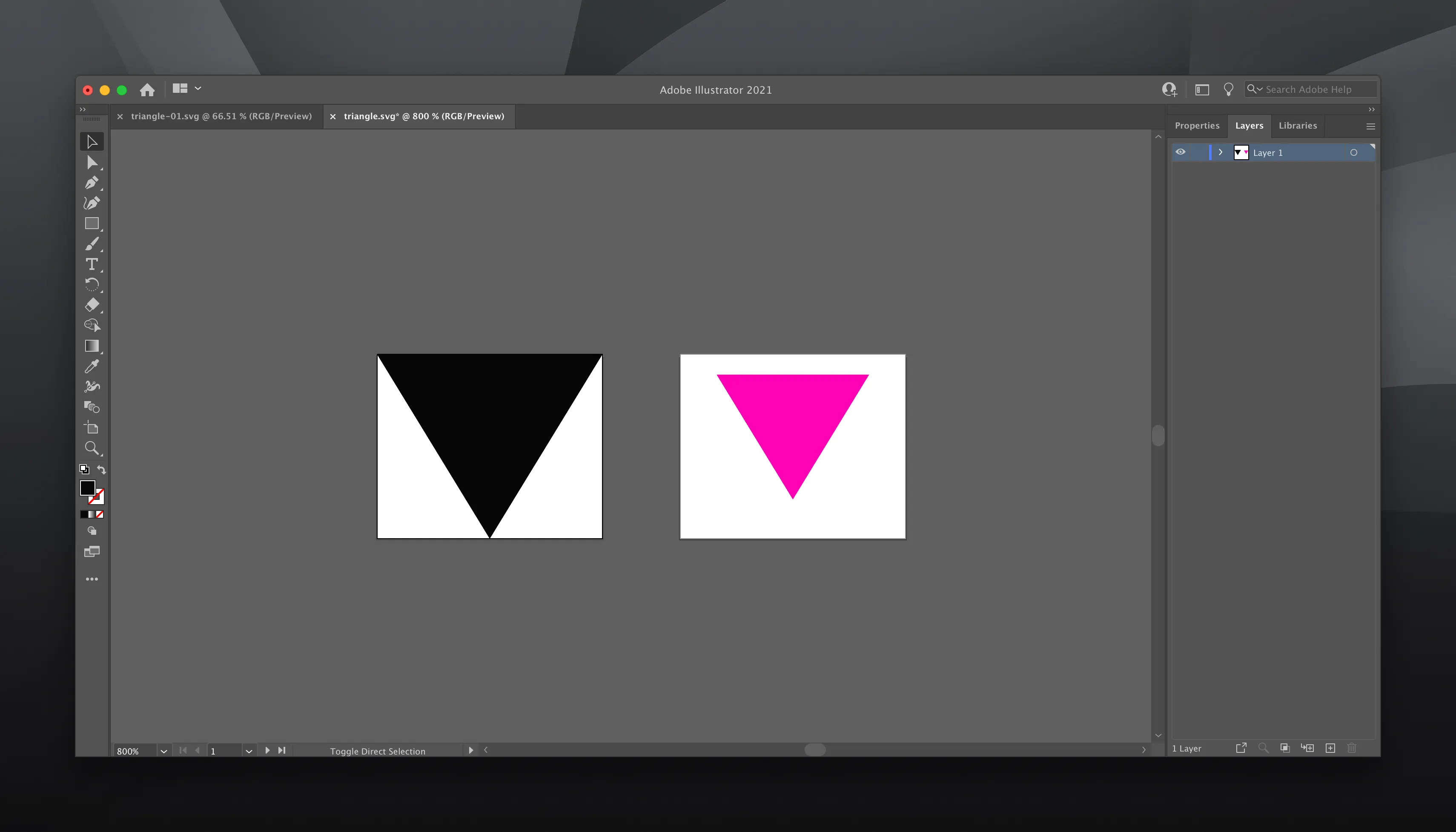
This makes positioning a breeze, since both can share the same offsets and ‘sit’ correctly on top of each other.
Shoot me an email if you’ve run into a similar problem, or come up with a more elegant solution.
Update (23/03/2021)
Ana Tudor has suggested a neat solution using clip-path. It works really well for the example in question, and demonstrates something I wasn’t aware of — you can mix units within a polygon. The triangle portion can be defined in em/px, while the rest in %. It’s very cool, and there’s also a fancy conic-gradient mask alternative in the Pen as well.
Nevertheless, my overall impression is that mask-composite remains the more flexible solution, since it becomes trivial to use any SVG shape as the mask, not just a triangle or a simple polygon. The likelihood is that you’ll want to simply export an SVG and drop it in. Engineering the inverse result as clip-path is likely to get pretty hairy quickly.