Wrapping text inside an SVG using CSS
Using two SVGs and shape-outside to wrap text inside a shape.
I’m a software engineer living and working in East London. I’m currently helping to build a one-stop-shop for the digitisation of alternative assets over at Daphne. Although once strictly front-end, today I work across the whole stack, including dipping my toes into DevOps and writing Rust & Go.
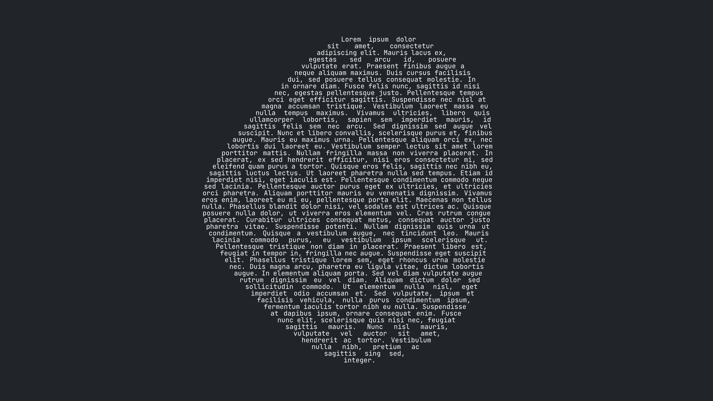
Wrapping text to the edge of a shape is easy, thanks to shape-outside. Wrapping text to the inside of a shape, like so, is a little more fiddly:
If you need a decorative piece of copy set inside a shape, your best bet remains creating it in your graphics editor of choice and inling the resulting SVG.
On fugitive sheets, however, each SVG is generated on-the-fly by blobshape, making graphics editors a non-starter. Fortunately — if you’re willing to put up with the web’s lack of a decent justification algorithm — it’s actually possible to accomplish something similar using shape-outside.
A tale of two shapes
Here’s our original SVG:

First we need to invert it, like so:

Then we need to split it:

This leaves us with one shape we can float left, and one we can float right. Sandwiching the copy produces an approximation of what we’re going for:
See the Pen Wrapping Text Inside an SVG: Shape Outside Prototype by Jay Freestone (@jayfreestone) on CodePen.
(I’ve inlined the mask into the CSS, but it works just as well using external assets.)
Programmatic conversion
It’s easy to chop and change shapes in Illustrator, but what about server-side? Thanks to masks and the viewBox attribute, it’s easier still.
We take our SVG:
 HTML<svg width="500" height="500" viewBox="0 0 500 500">
<g transform="matrix(1.14289,0,0,1.14289,-26.4017,-34.4466)">
<path d="M420,329C412,381.667 381.667,421 329,447C276.333,473 227.667,469 183,435C138.333,401 102,361.667 74,317C46,272.333 48,229.667 80,189C112,148.333 148.333,109 189,71C229.667,33 279.167,24.167 337.5,44.5C395.833,64.833 426.167,104.167 428.5,162.5C430.833,220.833 428,276.333 420,329Z" />
</g>
</svg>
HTML<svg width="500" height="500" viewBox="0 0 500 500">
  <g transform="matrix(1.14289,0,0,1.14289,-26.4017,-34.4466)">
    <path d="M420,329C412,381.667 381.667,421 329,447C276.333,473 227.667,469 183,435C138.333,401 102,361.667 74,317C46,272.333 48,229.667 80,189C112,148.333 148.333,109 189,71C229.667,33 279.167,24.167 337.5,44.5C395.833,64.833 426.167,104.167 428.5,162.5C430.833,220.833 428,276.333 420,329Z" />
  </g>
</svg>
Then we invert it by painting a solid rectangle and moving the contents of our original SVG inside a mask element:
HTML<svg width="500" height="500" viewBox="0 0 500 500">
  <mask id="shape-mask">
    <!-- Fill revealing everything -->
    <rect fill="white" width="200" height="200"></rect>
    <!-- The original SVG shape, which overlays (and cuts a hole in) in the mask -->
    <path d="M420,329C412,381.667 381.667,421 329,447C276.333,473 227.667,469 183,435C138.333,401 102,361.667 74,317C46,272.333 48,229.667 80,189C112,148.333 148.333,109 189,71C229.667,33 279.167,24.167 337.5,44.5C395.833,64.833 426.167,104.167 428.5,162.5C430.833,220.833 428,276.333 420,329Z" />
  </mask>
  <rect mask="url(#shape-mask)" width="500" height="500"></rect>
</svg>
Next we copy it, giving us our two halves. For the left-hand side, we simply half the horizontal viewBox dimensions, allowing the shape to ‘bleed’ off the canvas. For the right-hand side we do the same, but also apply a translation, shifting the mask over to display the correct half of the shape:
HTML<svg class="left" width="250" height="500" viewBox="0 0 250 500">
  <mask id="shape-mask">
    <rect fill="white" width="200" height="200"></rect>
    <g>
      <path d="M250,-0L250,10.652C228.26,17.372 208.13,29.387 189.604,46.698C143.127,90.128 101.602,135.082 65.029,181.559C28.457,228.036 26.171,276.8 58.172,327.849C90.173,378.898 131.698,423.851 182.747,462.709C204.345,479.15 226.763,489.453 250,493.619L250,500L0,500L0,-0L250,-0Z"/>
    </g>
  </mask>
  <rect mask="url(#shape-mask)" width="500" height="500"></rect>
</svg>

<svg class="right" width="250" height="500" viewBox="0 0 250 500">
  <mask id="shape-mask">
    <rect fill="white" width="200" height="200"></rect>
    <!-- Nudge over the mask, revealing the right-hand side of the shape. -->
    <g transform="translate(-250 0)">
      <path d="M250,-0L500,-0L500,500L250,500L250,493.619C281.68,499.298 314.883,493.567 349.608,476.424C409.8,446.709 444.468,401.755 453.611,341.563C462.754,281.371 465.992,217.941 463.325,151.273C460.659,84.604 425.991,39.651 359.323,16.412C319.228,2.436 282.785,0.517 250,10.652L250,-0Z"/>
    </g>
  </mask>
  <rect mask="url(#shape-mask)" width="500" height="500"></rect>
</svg>
And that’s it.
You can see an approximation of this technique in use on fugitive sheets (which uses JSDOM to accomplish the above) as well as in the initial prototype.
For fugitive sheets this worked out well, but it’s worth noting that:
- I was fine with the text alignment/justification, and even found the awkwardness charming for this particular use-case.
- I didn’t need all the copy to be visible at any given time. While this technique also works with text that overflows, the most common use-case involves keeping text contained within the shape. This would be hard (impossible?) to accomplish without risking obscuring copy.
It’s not perfect, but it might just be good-enough.